Just
Concept

Atabir
07
Packaging design
Project summary
Developed during the COVID-19 pandemic, this project centred on creating a minimalist sanitisation kit for the European market. The goal was to replace alarmist branding with a clean, professional aesthetic that fosters immediate trust.
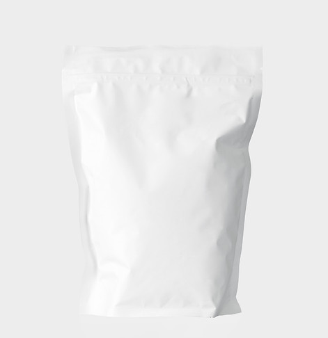
The final packaging leverages this minimalist style to reflect the kit's purity and function. By prioritising visual simplicity and clarity, the design aligns with European sensibilities, standing out as a sophisticated and trustworthy health solution during a global crisis.
Process
I made the strategic decision to utilise a clean and direct design to mirror the literal purity of the product. By stripping away visual clutter and adopting a light, clinical colour palette, the packaging acts as a visual metaphor for cleanliness, replacing pandemic-induced anxiety with a sense of professional safety.
This minimalist approach ensures that the brand communicates hygiene and reliability at a glance. By prioritising high-contrast simplicity and airy layouts, the final design stands out as a premium, trustworthy essential that aligns perfectly with modern European aesthetic standards and the heightened health needs of the era.


Outcome
The Atabir kit landed successfully in the European market by using a clean, direct design to build immediate trust during the COVID-19 pandemic. Its minimalist aesthetic and light, clinical palette resonated with consumers seeking safety without the alarmist noise of the era. This strategic focus on visual hygiene allowed the product to be exceptionally well-received, positioning it as a premium, reliable essential in the health and wellness sector.